
The SaaS interface design trends shaping 2026 — dark themes, micro-interactions, purposeful whitespace, and why restraint beats decoration in product UI.
Software interface design moves fast, but the best trends aren't about looking fashionable — they're about removing friction. Here's what we're seeing work across the SaaS landscape in 2026, and how we're applying these principles at F.I.D. Studio.
Dark Themes That Actually Work
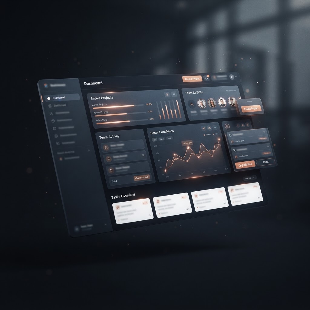
Dark mode has been a trend for years, but in 2026 we're seeing it done right. A proper dark theme isn't just "invert the colours" — it's a carefully calibrated palette where surfaces, text, and accents have deliberate contrast ratios. The best dark SaaS interfaces use a near-black background with layered surface tones (not flat #000000), warm rather than cool grey text, and a single accent colour that guides the eye.
At F.I.D. Studio, our products use dark palettes strategically. FrgeTrade's dark luxury aesthetic (near-black background with gold accents) works because trading tools benefit from reducing eye strain during long sessions. ChurchStage's dark interface is designed for a dim control room environment where a bright screen would be distracting during a worship service.
The principle: dark mode should serve a purpose — reduced eye strain, focus, or environmental fit — not just look cool in a screenshot.
Micro-Interactions That Earn Their Place
Micro-interactions (small animations triggered by user actions) are everywhere in 2026 SaaS design. Button hover states, loading shimmer effects, success animations, pull-to-refresh gestures. When done well, they make a product feel alive and responsive. When done poorly, they slow users down or distract from the core task.
The rule we follow: a micro-interaction must either provide feedback (confirming an action worked), guide attention (showing what to do next), or improve perceived performance (making a load feel faster). If it doesn't do one of those three things, it doesn't ship.
Purposeful Whitespace
The trend toward generous whitespace continues — and for good reason. Whitespace isn't empty space; it's breathing room that lets each element do its job. The best SaaS interfaces in 2026 use whitespace to create hierarchy without needing heavy borders, background fills, or section dividers.
This is especially important on mobile, where screen real estate is limited. A cramped mobile interface signals "we didn't think about this on a phone." A spacious one signals "this was designed for how you actually use it."
One Accent Colour, Not a Rainbow
The best SaaS products in 2026 use a single brand accent colour — not a spectrum. When every element is a different colour, nothing stands out. When one accent colour is used consistently for primary actions, active states, and key highlights, the interface becomes instantly scannable.
This is a discipline we apply across F.I.D. Studio products. Each product has its own accent — gold for FrgeTrade, a distinct brand colour for ChurchRide, etc. — but within each product, that accent is the only colour that draws attention. Everything else is neutral. This makes the interface feel calm and professional rather than chaotic.
Typography That Prioritises Readability
Inter, SF Pro, and similar humanist sans-serifs continue to dominate SaaS interfaces because they're genuinely readable at small sizes and on dense data screens. The trend we're seeing is pairing a clean sans-serif for body text with a slightly more characterful font for headings — creating personality without sacrificing legibility.
Variable fonts are also becoming more common, allowing weight adjustments that feel smooth and intentional rather than jumping between fixed weights.
What We're Not Doing
- Gradients everywhere: A subtle gradient on a hero section is fine. Gradients on every button, card, and background is visual noise.
- Glassmorphism overload: Frosted-glass effects work for overlays and modals. Using them on every surface creates a muddy, hard-to-read interface.
- Decorative illustrations: Stock illustrations that don't relate to the content slow users down and add visual weight without value. If an image doesn't help the user understand the product, remove it.
The Bottom Line
Good SaaS design in 2026 is about restraint. One accent colour. Purposeful whitespace. Dark themes that serve a reason. Micro-interactions that provide feedback, not decoration. The products that feel premium aren't the ones with the most visual effects — they're the ones where every design decision has a reason.